
This provides information on How To Photograph Products for Orderaway and is aimed at providing assistance when it comes to photographing Products for the purposes of displaying these in Menus in Orderaway.
Subjects ▲ ▼
Maintaining Consistency ▲ ▼
In branding, the primary goal for a clear and concise brand is consistency. This is also said for delivering any
visual aspect of a restaurant, including Orderaway menu items. The consistency of the food items includes
everything from lighting, colour (saturation and contrast), plating, framing of the Product, foreground and background imagery. To maintain consistency use the following as a guide:
- Photograph all menu items at the same time of the day for consistent lighting.
- The background and foreground of the setting should be the same or similar for each item of food. Use simple back drops and colour schemes to keep the item the focus of the image.
- Keep the plating consistent across all items, with simple and clean plating setups. Less is more, so keep things like cutlery and table decorations to a minimum or nothing if you want to play it safe.
- Framing of all menu items does not need to be the same, however the item must always be the first thing to grab the viewer’s eye. Remember the goal is to sell the item in one single photograph, so make sure it is the hero of the image.
- As Orderaway menu item images sizes can be quite small, make sure the Product is photographed close enough so that it identifiable to the patron.
Notes ...
The patron does not need to see every detail of the menu item, but there should be enough detail to make the item appealing.
- Stick to a colour theme and/or a light or dark themed menu. This will be very much dictated by the Restaurant’s menu. For example:
Cafe/Lunch restaurants will usually tend to go for a lighter colour scheme.
Dinner-based restaurants, like a steak house will usually go for a darker colour scheme.

Good Lighting ▲ ▼
Lighting is key for any Product image, whether that be, artificial light or natural lighting. The key is to have the object well-lit but not blown out. Avoid direct sunlight where the highlights in the image can blowout or in fluorescent artificial light that can cause the image to be flat with little to no contrast between light and dark. It is always better to photograph Products in natural, in-direct lighting. This will help create soft shadows and pull focus onto the item.
If using artificial lighting it is recommended to use lighting umbrellas so any flash will be diluted and create a softer light against the item instead of the harsh light created directly from the flash.
If no proper artificial lighting is available, shoot near a window and use thin white curtains or white bed sheet to diffuse the light coming in. If it is a bright but overcast day, the curtain may not be necessary as the clouds are doing the work for you.
Colour And Contrast ▲ ▼
Like lighting, it important to recognize the role colour and contrast can play when photographing menu items.
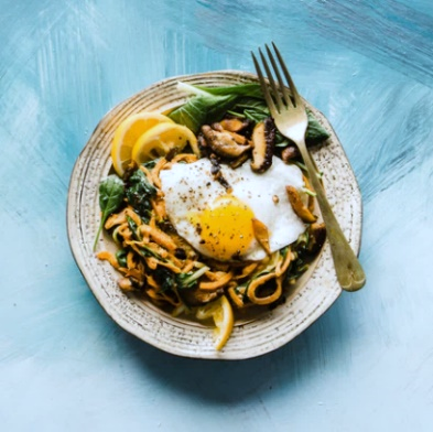
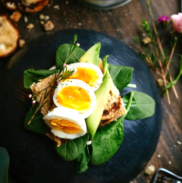
Because the menu item images are quite small, it is important to have a good amount of colour in the image to make the item pop off the screen. Like the image on the left, a contrasting background colour, in this case the blue can help to draw the eye to the other contrasting colour in the Product, in this case the yellow. This can further be accentuated by increasing the contrast between the light and darks areas of the image. Most image programs (even Microsoft Word) will allow a user to edit both the saturation and the amount of contrast in the photo.
Example: The original image below is well lit, however there is not enough brightness in the image. By adding more contrast or saturation to the same image, the Product suddenly has a lot more vibrancy to it.
Original
Increased Contrast
Increased Saturation
If increasing the saturation starts to make the image look all the one colour, like a pink tone for example. Look for the colour tone or temperature tool to increase or decrease the hue of the image.
Framing ▲ ▼
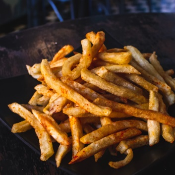
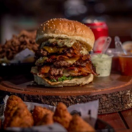
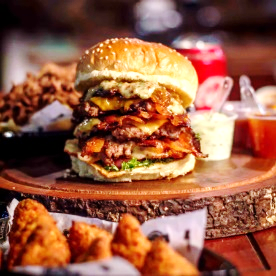
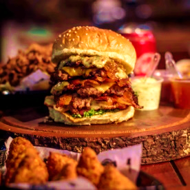
Framing is crucial for guiding the viewers focus to the item in question. In the images above there are other food items in both the foreground and background, this can distract the viewers eyes. The image below illustrates how cropping an image can pull the focus onto the subject matter avoiding distractions.

However, framing also requires the subject matter to fit into the context of the image. So, aim to have enough background or foreground in the image to give the subject matter its context. For example, the plate it sits on or the dipping sauce that goes with it.
Do not be afraid to frame the subject matter slightly off centre or to one side. If done well, this can create a more dynamic image, attracting the viewers eyes to the image as they browse the Orderaway menu.
Focus ▲ ▼
Like framing and lighting, focus is a fine balance between attracting the viewers eye to the subject matter without other parts of the image taking too much attention away. Again, if done well, focus can pull the viewer to the subject matter, while allowing the peripherals of the image to complement the subject matter. As in the image below.
Most cameras and newer model smart phones will have automatic focus capabilities
If using a smart phone, like an iPhone, to take the images. Hold down anywhere on the screen when framing your shot, to adjust the focus to that area.
Other Considerations ▲ ▼
- Less is More - Not every Product in the menu may need an image. For example, a coffee menu with different varieties of coffees may not need to have an image set against each variety of coffee. We all know what a latte looks like.
- Multiple Angles - Some food items take better photos at different angles.
- Top Down - This tends to be the best angle for most food items. A catch all angle, top down is great for pizzas, steaks, and many other plated meals.
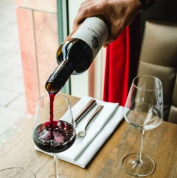
- 45 Degrees - This angle is great to add dynamics to your menu. Allowing some items to be photographed at a 45-degree angle will break up any monotony from the top-down angle above. This works great for drinks including wines, beer, coffee, and cocktails as well as many regular food items. Do not be afraid to shoot from multiple angles.
- Side Angle - Shooting at the same level as the subject matter obviously will not work for foods like pizza, however, this will work great for taller items like burgers, cakes, and large steaks.
- Branded Menu Items - Like wines and beers and like the Less is More point (made above), not all items may need an image of a branded bottle against them. An effective way to promote items that you want is to only assign an image to that item, distinguishing it from the rest of the items in the menu.
If photographing wines or beer bottles, to make it a little more interesting and dynamic put more than one bottle in the shot or add an actual glass of the Product with the bottle. Having a grouped subject matter with 2 or 3 items will give the overall image more weight.
- Action Shots - If feeling a little brave, spice up a menu with action shots. This can be a fantastic way to add more dynamic to your menu imagery and can showcase a certain menu item. Examples: a steak being flipped on the grill, or a wine in mid pour.
End of article ▲