
Subjects ▲ ▼
About ▲ ▼
What Is Required? ▲ ▼
- Ensure at least one staff member has the appropriate Clerk Security Group access to the following Clerk Group Permissions:
- Events > Catalogues & Menus
- Products >
- Product Records
And/Or - Product Quick Edit
- Product Records
- Ensure Products exist. Special attention needs to be given to their Pricing and Status (This should be set to Active within the appropriate Locations).
- Refer HERE for more information.
When Is It Used? ▲ ▼
Used to configure and manage the Catalogues & Menus. Refer HERE for an explanation of the term Catalogue and HERE for an explanation of the term Menus.
Screens ▲ ▼
Events Catalogue Screen ▲ ▼
To access, select the Catalogue & Menus option from the Events menu in Back Office. Used to configure and manage the Catalogues & Menus. Refer HERE for an explanation of the term Catalogue and HERE for an explanation of the term Menus.
Sections ▲ ▼
Catalogue Section ▲ ▼
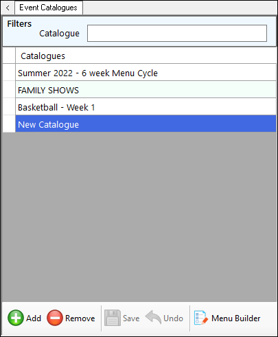
Displayed on the left-hand side of the Event Catalogues screen. Used to configure/manage Catalogues.
Used to limit the number of rows displayed in the grid. The filters include the following types:
- Full/Partial Texts – The filter of this type is Catalogue. Enter a full or partial text, to search the available Catalogues and return only those that contain an occurrence of the text entered.
Displays a list of Catalogues that can be selected for Event Sessions. Lists their names.
- Add - Select to add a Catalogue.
- Remove - Select to remove the selected Catalogue.
- Save/Undo - Select to save/undo the changes made.
- Menu Builder - Select to open the Menu Builder screen to create/manage Menus
Menus / Items / Rules Section ▲ ▼
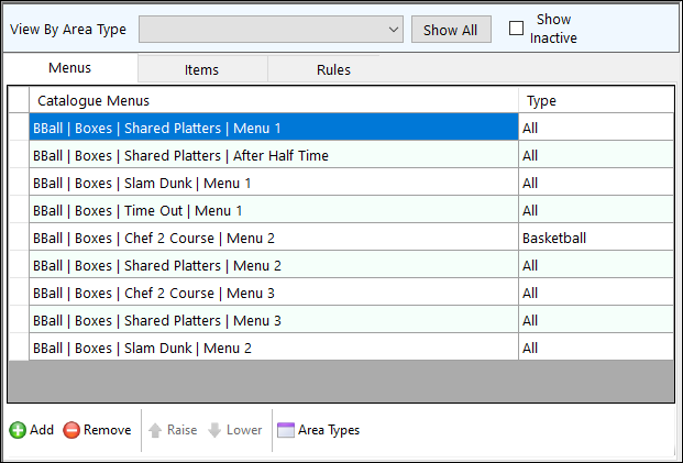
Used to limit the number of rows displayed in the grid. The filters include the following types:
- Buttons - The filter of this type is Show All.
- Checkboxes - The filter of this type is Show Inactive.
- Drop-Down Lists - The filter of this type is View By Area Type.
Displayed on the right-hand side of the Event Catalogues screen. Used to configure/manage Menus, Items and Rules.
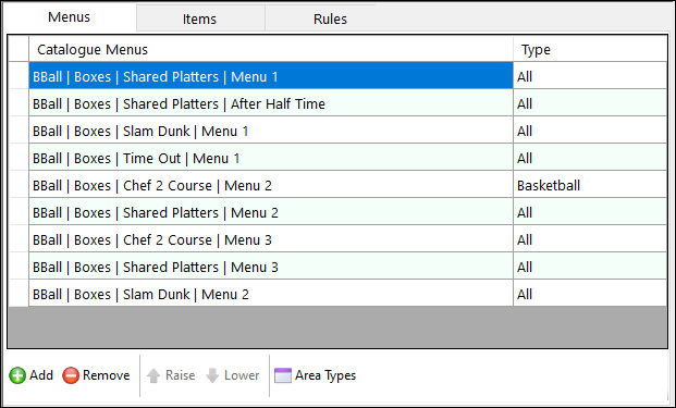
Grid Section
Displays a list of available Menus and their Types.
Footer Section
- Add - Select to open the Add Menus to Catalogue screen to select one or more existing Menus to add to the selected Catalogue.
- Remove - Select to remove the selected Menu from the selected Catalogue.
- Raise/Lower - Select to either move the selected Menu up or down in the grid.
- Area Types - Select to split the Menus tab grid section and display the Area Type section in the lower section.
Area Type Section
Display the Area Types that are currently assigned (selected) to the Menu selected in the section above. For example:
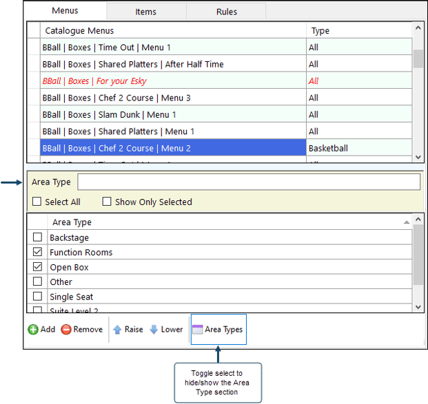
Example of the Menus tab split to display the Area Types after selecting the Area Types option.
Filters Section
Used to limit the number of rows displayed in the grid. The filters include the following types:
- Checkboxes - The filters of this type are: Select/Unselect All and Show Only Selected.
- Full/Partial Texts – The filter of this type is Area Type. Enter a full or partial text, to search the available Catalogues and return only those that contain an occurrence of the text entered.
Grid Section
Displays a list of available Area Types.
Header Section
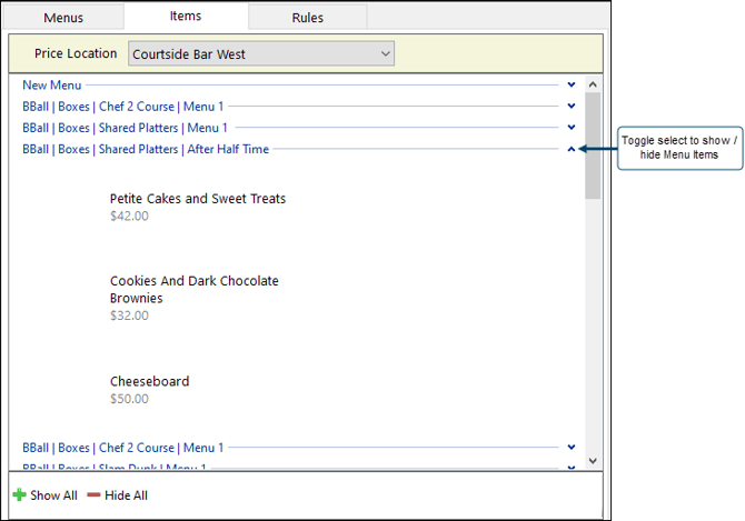
- Price Location - Select to display the prices of Menu Items in a selected Location. Prices of Menu Items may differ from Location to Location.
Grid Section
Displays all the Menus (Catalogue & Menu combinations) available, as well as their Items and (if selected above) the Price associated with the Price Location selected above.
- Show/Hide All - Select to expand/collapse all Menus to either show/hide their Items.
Grid Section
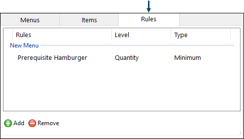
Displays all the Rules available, as well as their Level and the Type.
Notes ...
Double select any Rule listed, to open the Rule Builder Wizard screen and edit it.
Footer Section
- Add - Select to open the Rule Builder Wizard screen to add a Rule.
- Remove - Select to remove the selected Rule from the grid.
End of article ▲